
I once built a landing page that got tons of traffic but barely any signups. The headline was solid. The design looked clean. But the call to action? It just said “Submit.”
That one word was killing my conversions.
A call to action lives or dies on the small stuff: the button text, the color, where it sits, and the copy around it. Get those right and a good page turns visitors into signups. Get them wrong and even a beautiful page falls flat.
So this guide gives you both halves. First, 11 real call to action examples worth copying, then the 10 best practices I use to make my own CTAs click-worthy. You will see what great looks like, and exactly how to build it.
TL;DR: Call to Action Best Practices.
A call to action is the prompt that tells a visitor what to do next. Small changes to it move real numbers.
Here is what actually works:
- Lead with the benefit – “Get My Free Guide” beats “Submit” every time.
- Make it stand out – Use a high-contrast color and white space so the button is impossible to miss.
- Keep it short – The best-performing buttons run about 3 to 4 words.
- Match it to the page – Soft CTAs up top, high-intent CTAs after the pitch.
- Test one thing at a time – Change the wording or color, then measure what wins.
- Steal from the pros – The 11 examples below show these rules in action.
What Is a Call to Action?
A call to action (CTA) is any prompt that tells your visitor what to do next.
It’s usually a short line of text paired with a button, like “Download Now,” “Start Free Trial,” or “Get My Guide.” CTAs can also appear as links, banners, or opt-in forms across your site.
On a landing page, your CTA is the moment of decision. It’s where visitors either take action or leave.
That’s why strong CTAs matter. The right wording, design, and placement can lead to more clicks, signups, and sales.
11 Call to Action Examples for Websites and Emails
Before we get into the rules, let’s look at what great CTAs actually look like. Here are 11 real examples I keep coming back to, and exactly why each one earns the click.
1. OptinMonster: Urgency-Driven CTA
| CTA: Get OptinMonster Now |
| Best For: Landing pages and popups |
| Why It Works: Urgency words plus an instant benefit |
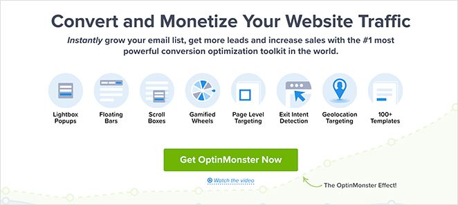
I’ve always liked how OptinMonster uses urgency in its calls to action. The headline grabs you right away, and the button text, “Get OptinMonster Now,” makes you feel like you should act fast.
As a business owner, I’m drawn to CTAs that show the benefit upfront. This one promises to help you grow your email list, get more leads, and increase sales.
The word “instantly” sets the expectation that you’ll see results right away. That is a strong motivator to click, and it’s easy to borrow for your own pages.
2. IsItWP: Lead Magnet CTA
| CTA: Yes, Send Me the Free eBook! |
| Best For: Email signups with lead magnets |
| Why It Works: Clear value exchange plus action verbs |
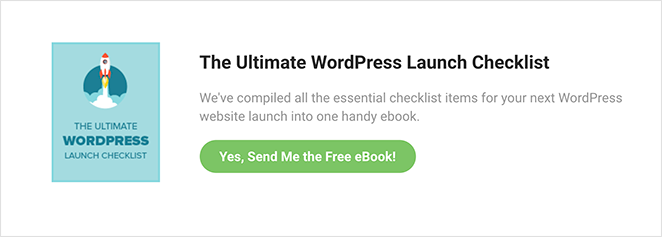
IsItWP consistently uses lead magnets to drive signups. The “Yes, Send Me the Free eBook!” button is a great example of offering something valuable in exchange for an email address.
I like that the offer is front and center and tied to a clear benefit: a free eBook with all the essentials for a WordPress launch. It’s exactly the kind of resource their readers want.
The action verb “Send” makes the process feel quick and easy. I’ve found this kind of first-person copy works well to lift conversions.
3. WPForms: Community Join CTA
| CTA: Join Now… it’s free! |
| Best For: Growing online groups |
| Why It Works: Highlights no cost plus exclusivity |
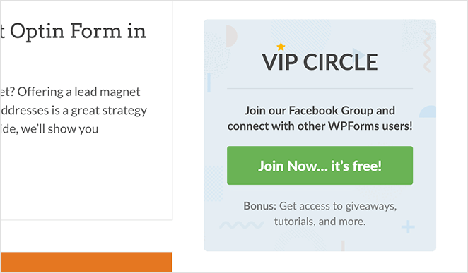
On the WPForms blog, I spotted a simple but effective ad encouraging readers to join the WPForms VIP Circle Facebook group. The CTA, “Join Now… it’s free!” is exactly the language I use when I want people to act right away.
It works because it removes hesitation. It’s free, it’s exclusive, and it’s relevant to readers already browsing the content.
Community offers like this perform well. People want to feel connected and get access to extras, so it’s a great approach if you’re growing a group.
4. Crazy Egg: Demo Request CTA
| CTA: Show Me My Heatmap |
| Best For: Product demos |
| Why It Works: Speaks in the user’s voice and builds curiosity |
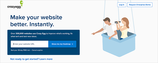
I love how Crazy Egg uses its “Show Me My Heatmap” button. It’s in the customer’s voice, which makes the offer feel personal.
The copy is clear and builds curiosity at the same time. Social proof sits right beside it, so seeing how many companies already use Crazy Egg gives you extra confidence before you click.
The free trial and cancel-anytime note removes the risk. It’s one of the smartest demo CTAs you’ll find.
5. Moz: Event Registration CTA

| CTA: Grab My Ticket! |
| Best For: Event signups |
| Why It Works: Scarcity language plus urgency |
Moz has always been good at marketing, so it’s no surprise their event CTA stands out. The “Grab My Ticket!” button is fun and urgent without being pushy.
The surrounding copy builds excitement by asking if you’re ready, then tells you exactly what you’ll get at the virtual event. There’s no guesswork, which makes it easier to click.
Whenever I run events, I use the same approach: a bold headline, clear benefits, and button text that makes the reader want to act now.
6. Uber: Sign-Up CTA
| CTA: Sign Up to Drive |
| Best For: Service sign-ups |
| Why It Works: Simple, action-focused copy |
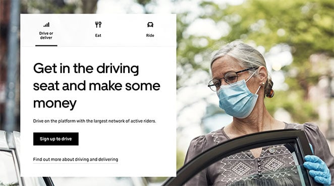
Uber’s “Sign Up to Drive” call to action is a perfect example of keeping things simple. It’s direct, action-focused, and tells you exactly what you’re signing up for.
The headline reinforces the payoff, that you can earn money by driving. That helps the reader picture what success looks like if they click.
This CTA works because it’s so easy to understand. If you’re writing your own, don’t overthink it. Be clear and show the reader what’s in it for them.
7. Madewell: Ecommerce Product CTA
| CTA: Make ’em Yours |
| Best For: Ecommerce product pages |
| Why It Works: Emotional trigger plus ownership language |
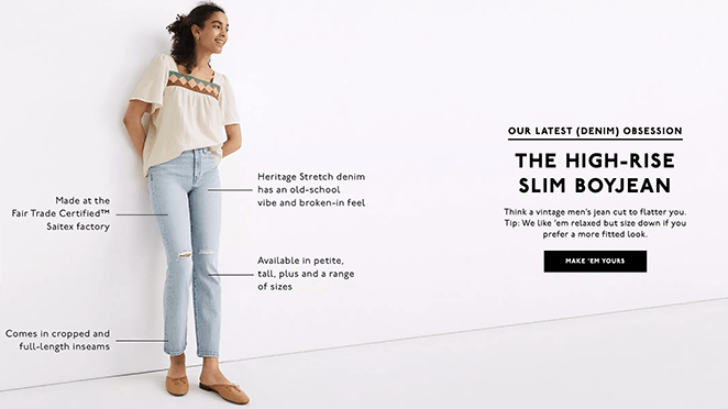
Madewell’s “Make ’em Yours” button is one of my favorite ecommerce CTAs. It’s short, playful, and taps into the emotional side of shopping.
What I like most is how it connects with the product imagery. The copy makes you feel like Madewell has the perfect pair, then the button invites you to claim them as your own.
CTAs that focus on ownership like this tend to drive more clicks than a generic “Buy Now” button.
8. Traffic & Conversion: Discount Offer CTA

| CTA: Claim Your Discounted Ticket |
| Best For: Event promotions |
| Why It Works: Strong incentive plus clear benefit |
Digital Marketer’s Traffic & Conversion Summit has a standout CTA: “Claim Your Discounted Ticket.” It pairs the incentive (a discount) with a sense of ownership (“claim”), which makes the offer feel more valuable.
The bullet points leading up to the button are strong too. They list exactly what you get by attending, so the CTA doesn’t feel like a gamble.
If I were optimizing this page further, I’d add a countdown timer. In my own campaigns, limited-time CTAs convert noticeably better.
9. Yoga International: Free Trial CTA
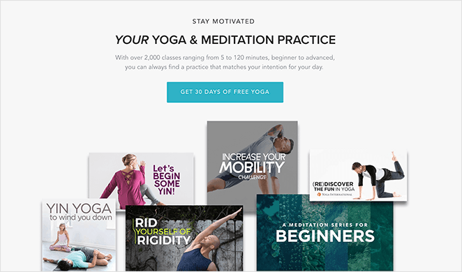
| CTA: Get 30 Days of Free Yoga |
| Best For: Subscription free trials |
| Why It Works: Risk-free offer plus a clear time limit |
Yoga International repeats its main CTA several times down the page. The “Get 30 Days of Free Yoga” button is risk-free and clear, two things I look for in a good free-trial offer.
Placing the button at the top, middle, and bottom makes it easy to click when you’re ready. I use this same strategy on product pages because it catches people at different decision points.
And the promise of “free” is always a strong motivator. It’s a great example of a low-friction offer done well.
10. GiftRocket: Unique Brand CTA

| CTA: Send a GiftRocket |
| Best For: Gift card purchases |
| Why It Works: Branded language plus a fun tone |
GiftRocket does a great job with its branded CTA. Instead of something boring like “Buy Now,” they invite you to “Send a GiftRocket.”
That small wording change makes the action feel special, and the “as seen in” logos add credibility.
It’s a reminder that you don’t have to use the same CTA copy as everyone else. A little creativity goes a long way.
11. I Will Teach You to Be Rich: Quiz CTA

| CTA: Start the Quiz |
| Best For: Segmenting leads |
| Why It Works: Low commitment plus a curiosity hook |
Ramit Sethi’s “Start the Quiz” CTA is one I’ve borrowed for my own funnels. It’s low commitment, but it leads to highly personalized follow-ups.
What I like most is the framing: you take a quiz to get content that fits your needs. That’s far more appealing than signing up for a generic newsletter.
This approach works especially well if your products or courses are expensive. It lets you build trust before asking for a bigger commitment.
Notice the pattern? Every one of these leads with a benefit, uses plain language, and makes the next step feel easy. That’s exactly what the best practices below help you do on your own pages.
10 Call to Action Best Practices to Try Now
Improving your CTA isn’t just about writing better button text. It’s about understanding what makes people click.
I’ve tested dozens of variations on different pages. In some cases, changing just one word or moving a button slightly made a real difference in conversions.
But random guesses won’t help. These call to action best practices are based on what actually works and why.
Let’s start with placement, because where your CTA goes matters just as much as what it says.
1. Use the Right CTA for the Right Spot on the Page
Not every CTA belongs at the top of your page. Where you place it should match where your visitor is in their decision-making process.
Here’s a simple way to think about it:
- Top of the page: Use soft CTAs like “Learn More” or “See How It Works.” These work best for visitors who are just getting familiar with your offer.
Middle of the page: Try a mid-intent CTA like “Start Free Trial” or “Download the Guide.” By now, your reader has more context. - Bottom of the page: This is where to put high-intent CTAs like “Buy Now,” “Book Your Call,” or “Join Today.” They’ve seen the full pitch and are more likely to take action.
I’ve had good results using multiple CTAs on the same page, each matched to the section it appears in.
2. Write CTA Text That Focuses on the Benefit
Your CTA should answer one simple question: What will I get?
Benefit-focused text, like “Download My Free Guide” or “Start My Free Trial”, works better than vague commands like “Submit” or “Click Here.”
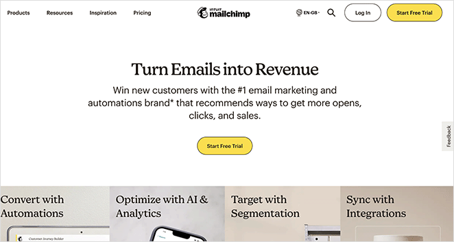
One test showed that clearly stating the benefit can increase conversions by up to 161 percent.
That’s because it speaks directly to what your visitor wants. Instead of telling them what to do, you’re showing them what they’ll get.
| Weak CTA | What’s Missing | Better CTA |
|---|---|---|
| Submit | No context or value | Download My Free Checklist |
| Sign Up | Vague action | Start My Free Trial |
| Learn More | No clear benefit | See How to Boost Conversions |
Tip: Try using first-person language when it fits.
3. Make Your CTA Visually Stand Out
Your CTA button should be impossible to miss. If it blends into the background, visitors are more likely to scroll past it than click.
Start by making the button feel clickable. Use a bold font, clear shape, and enough padding around the text. It should look like something that invites action, not like part of the background.
Spacing matters just as much. Add white space around the button so it has room to breathe. Avoid cramming it between other elements or placing it on a busy background.
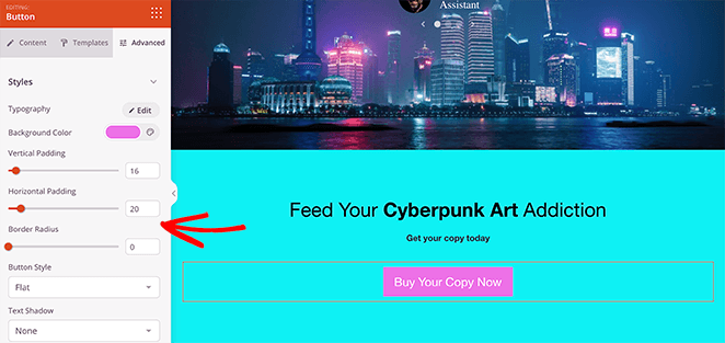
Keep it clean, clear, and focused. A good CTA should draw the eye the moment the visitor is ready to act.
4. Choose Button Colors That Attract Clicks
Color plays a major role in whether people notice and act on your CTA. Here’s what to keep in mind:
A/B tests show that a high-contrast button can significantly outperform one that blends into the background. In one case, using a bold red instead of green increased clicks by 21% on the same page design.
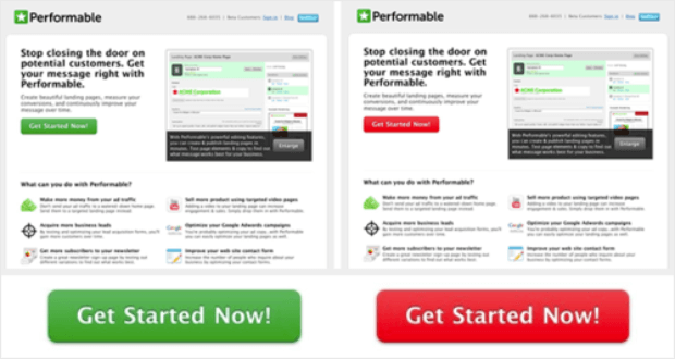
That kind of gain comes purely from choosing the right color.
When choosing your CTA color:
- Pick a hue that stands out against your primary site palette.
- Use accessibility tools to ensure there’s enough contrast for all users.
- Stick to one attention-grabbing color per page to avoid visual competition.
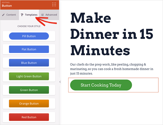
Tip: SeedProd’s button styling options make it easy to test and update button colors without needing a developer.
5. Use Psychology to Boost CTA Performance
To make your CTA more compelling, tap into basic human psychology. Techniques like urgency, reciprocity, and social proof can all increase clicks.
Urgency gives people a reason to act now instead of waiting. Adding limited-time phrases like “Offer ends soon” can increase conversions by up to 332 percent compared to CTAs without urgency.
Reciprocity is about giving something before asking for action. A free guide, checklist, or trial makes people feel more willing to opt in or take the next step.
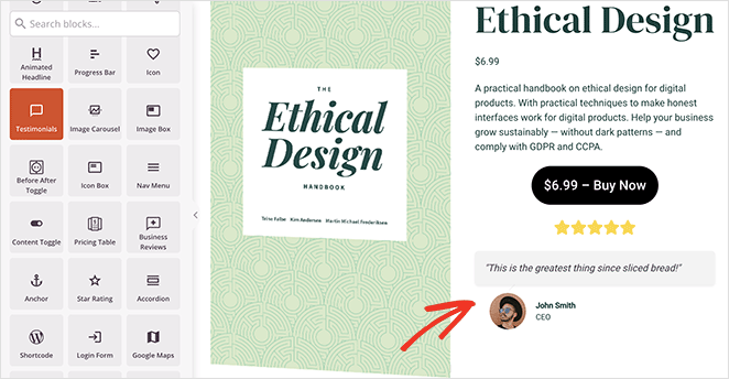
Social proof builds trust by showing that others have already taken action. Nearby testimonials, ratings, or real-time activity can make your offer feel safer and more credible.
Use emotionally charged words like “Now,” “Instant,” or “Exclusive” to add extra motivation.
6. Keep Your CTA Short, Clear, and Focused
Short CTA copy performs better because it’s faster to read and easier to act on. One study found that the average high-performing CTA contains just 3 to 4 words, which makes brevity a consistent trait in buttons that convert.

Your goal is clarity, not cleverness. Avoid vague phrases like “Click Here” or “Submit.” Instead, lead with an action word that matches the benefit, such as “Download Guide” or “Start Trial.”
Watch out for friction words that sound like effort or commitment. Terms like “Buy,” “Order,” or “Register” can create hesitation. Softer alternatives like “Get,” “Try,” or “See” often feel more approachable.
A helpful test: can someone understand your CTA in two seconds or less? If not, simplify it.
7. Test and Tweak Your CTA to Improve Results
The best CTAs come from testing, not guessing. A/B testing helps you compare two versions of a CTA to see which one actually gets more clicks and conversions.
Start small. Test one change at a time, like the wording, color, size, or placement of your button. Keep everything else the same so you can isolate what’s working.
One real-world example comes from Leadferno’s A/B test for Fox Pest Control. Simply replacing a standard phone-based CTA with a “Text With Us” widget led to a 201% increase in conversion rate.
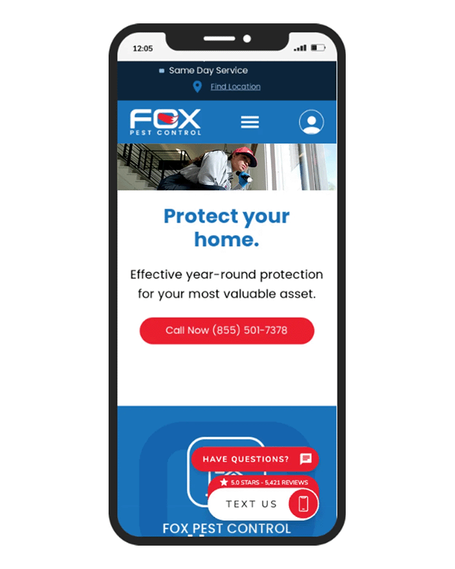
In just over a month, leads tripled, without increasing traffic or changing the rest of the page.
If you’re using WordPress, you can follow this guide on how to set up A/B testing for landing pages to start gathering data.
Even small changes can lead to big results. Testing helps you build CTAs based on real user behavior, not assumptions.
8. Make Sure Your CTA Works on Mobile
More than half of web traffic now comes from mobile devices. If your CTA isn’t easy to tap, you’re missing out on clicks.
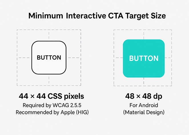
Interactive targets should be at least 44 × 44 CSS pixels, as required by WCAG 2.5.5 and recommended by Apple in its Human Interface Guidelines (HIG). For Android and Material Design, the minimum is 48 × 48 dp.
Spacing matters too. Buttons that are too close together or placed in cluttered layouts can lead to mis-taps. Some studies have found that poor mobile design leads to “rage taps,” where users tap repeatedly out of frustration.
To improve CTA performance on mobile:
- Use large, thumb-friendly buttons with plenty of padding
- Avoid stacking buttons too closely
- Keep your most important CTA near the bottom of the screen where thumbs can reach
- Test it on a real phone to make sure it’s easy to tap and read
Even a well-written CTA can fail if users can’t easily click it. Make it mobile-friendly, so every visitor has a chance to convert.
9. Add Helpful Copy and Proof Around Your CTA
Your CTA doesn’t exist on its own. The words and visuals around it shape how people feel about clicking.
A strong headline or subheadline can remind visitors of the value they’re getting. A short list of benefits reinforces the offer. And a trust badge or testimonial nearby helps build confidence.
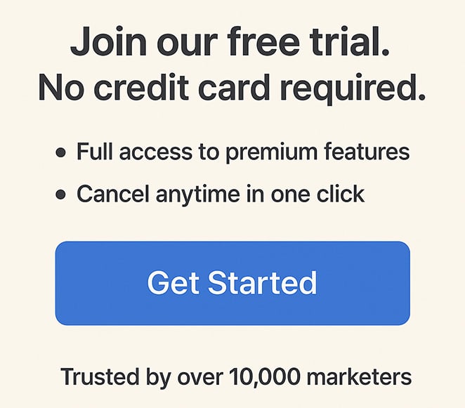
Here’s an example of what that might look like:
Headline/Subhead
“Join our free trial. No credit card required.”
Bullet list
- Full access to premium features
- Cancel anytime in one click
Trust element
“Trusted by over 10,000 marketers”
This kind of supporting content answers key questions like “What do I get?” and “Can I trust this?” right at the point of decision.
When everything around the button supports the click, your CTA feels more natural and more convincing.
10. Use Proper Markup to Make CTAs Accessible and SEO-Friendly
Your CTA needs to be easy for people to use and clear for search engines to understand. That means writing good copy, but also using the right HTML structure.
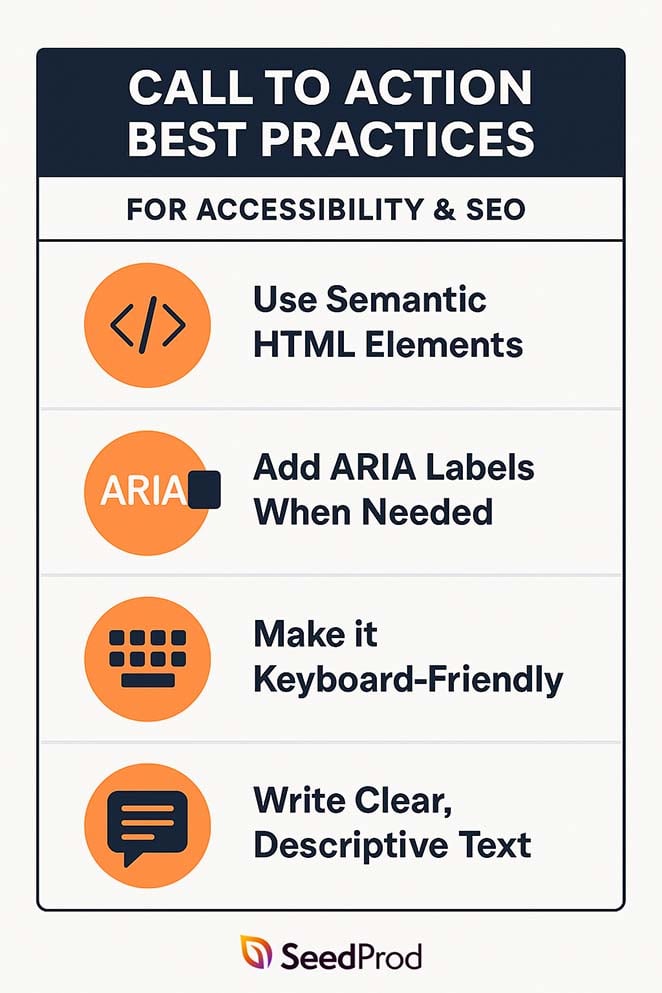
Use Semantic HTML Elements
Always wrap your CTA in a <button> or <a role=”button”> tag. This tells assistive technology and search engines that it’s interactive.
Add ARIA Labels When Needed
If the button text is short or unclear, use an aria-label to add context.
Example:
<button aria-label=”Start my free trial”>Start Trial</button>
Make it Keyboard-Friendly
Your CTA should work for users who navigate with a keyboard. Make sure they can tab to the button and press Enter or Space to activate it.
Write Clear, Descriptive Text
CTAs like “Download the Free Guide” give search engines more context than generic phrases like “Click Here.” This also helps your content appear in rich results or AI summaries.
Clean, accessible markup helps your CTA reach more people and support your page’s visibility in search.
How I Built a High-Converting CTA With SeedProd
I’ve tested a lot of CTA tools, but for WordPress landing pages, I keep coming back to SeedProd.
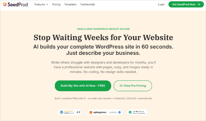
It’s a drag-and-drop page builder that lets you create custom landing pages, opt-ins, and CTA sections without writing any code.
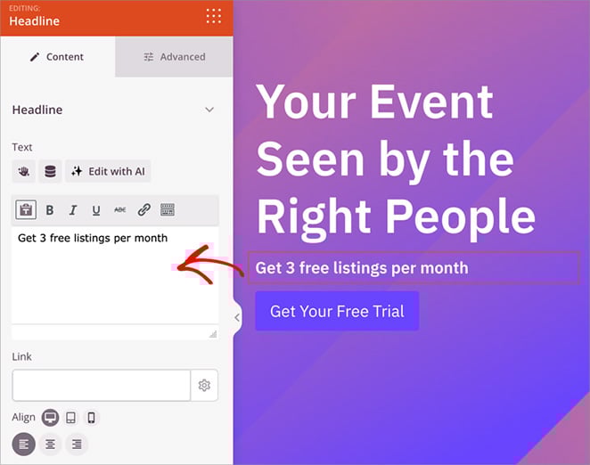
To build one of my favorite CTA sections, I started by opening the SeedProd editor and dragging in the Call to Action block.
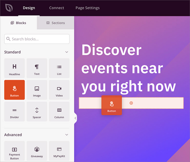
From there, I updated the headline and button text to focus on the benefit. Instead of a generic label like “Submit,” I used “Get Your Free Trial,” and added a short subheadline to explain what the trial includes.
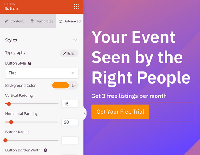
Next, I adjusted the button styling. I picked a bold color that stood out from the rest of the page and increased the font size so it would be easy to tap on mobile.
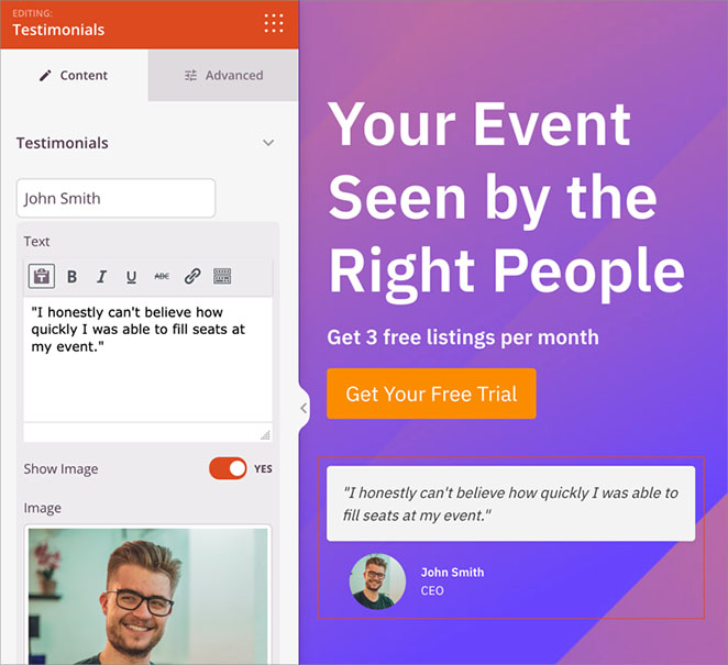
I also left plenty of white space around the CTA to make it feel clean and focused, and added a short testimonial underneath for extra trust.
SeedProd made the entire process simple. I could build and preview the full section in real time, with no need for custom code or extra plugins.
For a full walkthrough, see my guide on how to create a landing page in WordPress.
FAQs About Call to Action Best Practices
What’s the best length for a CTA?
Short and clear is best. Most high-performing CTAs are between 2 and 6 words. This makes them easy to read and act on quickly.
How many CTAs should I use on a landing page?
It depends on the length of the page. For short landing pages, one clear CTA is often enough. For longer pages, it’s smart to repeat the CTA in key spots, like the top, middle, and bottom.
What button colors get the most clicks?
There’s no universal best color, but contrast is key. Choose a color that stands out from your page background. One test found that red buttons got 21% more clicks than green ones, just because they stood out more.
Where should the CTA go on the page?
It depends on user intent. Place soft CTAs near the top, like “Learn More,” for visitors still exploring. Mid-funnel CTAs work well after some context, and high-intent CTAs belong near the bottom once you’ve made your pitch.
Can I use more than one CTA?
Yes, as long as they don’t compete with each other. For example, you might have one main CTA and a softer secondary option. Just be sure the page has a clear focus.
Should I use buttons or text links for CTAs?
Buttons usually win because they stand out. A text link can get lost inside a paragraph, so I save text links for secondary actions and always style them so they are easy to spot.
Ready to Build a CTA That Converts?
Strong CTAs don’t happen by accident. Every detail matters, from the words you choose to the color, placement, and context around the button.
By following these call to action best practices, you’ll give visitors more reasons to click and fewer chances to walk away. And with a tool like SeedProd, you can build, test, and improve high-converting CTAs quickly without extra plugins or code.
If you want to keep improving your landing pages, here are a few more guides I recommend. Each one focuses on a specific part of building high-converting CTAs and the pages around them.
- How to Add a Button in WordPress (Step by Step)
- Expert Landing Page Optimization Tips
- How to Build a Sales Page in WordPress
- How to Create a Lead Capture Page in WordPress
- How to Create a Squeeze Page in WordPress
Thanks for reading! We’d love to hear your thoughts, so please feel free to join the conversation on YouTube, X and Facebook for more helpful advice and content to grow your business.